User Experience
Introduction:
Herd Group Global was briefed to conduct a comprehensive User Experience (UX) and Conversion Rate Optimisation (CRO) audit for one of the UK’s leading private clinics in the cosmetic surgery industry. They wanted to elevate its website user experience and boost the volume of booking inquiries by implementing a continuous program of UX/UI enhancements.
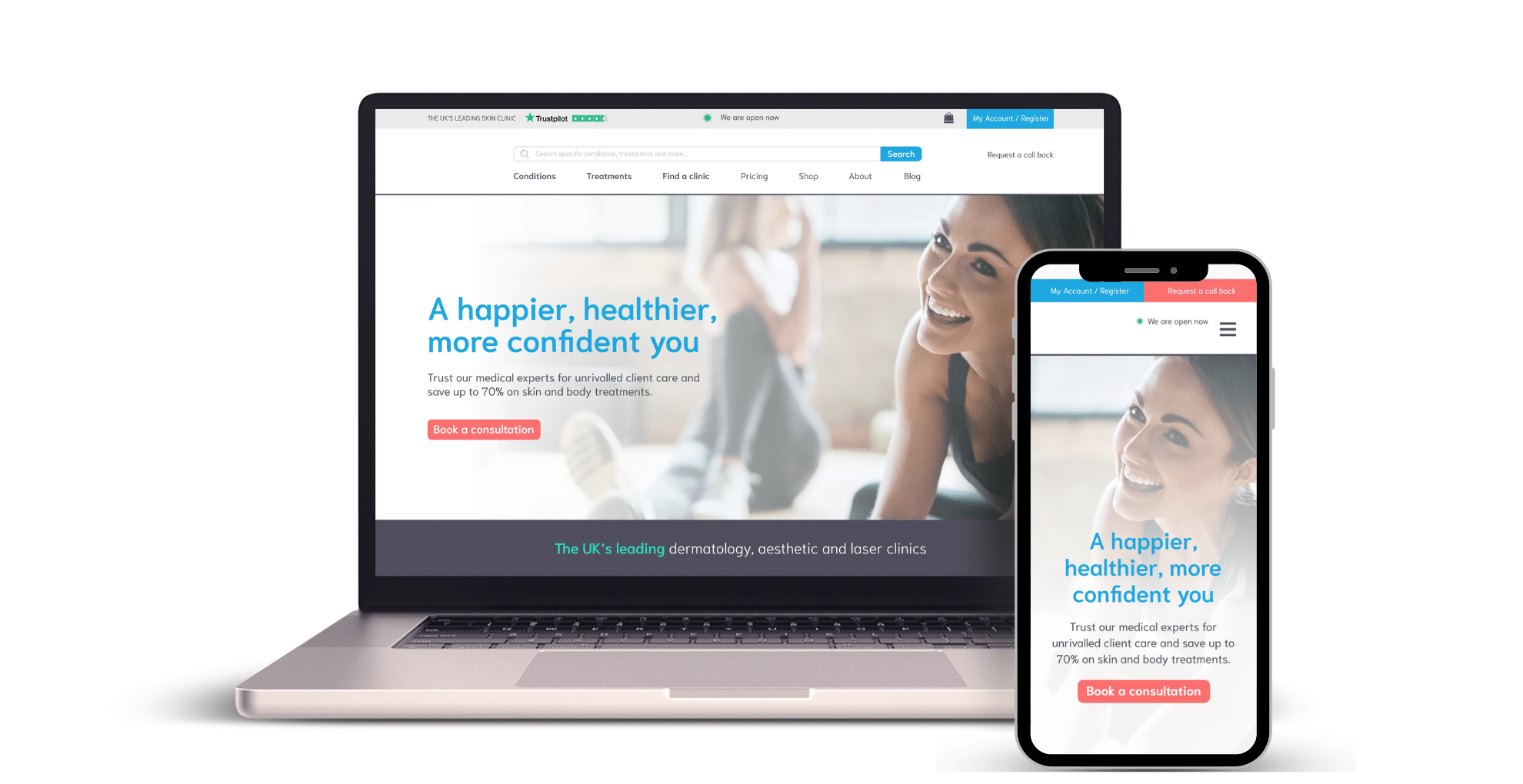
The primary focus areas of our engagement encompassed the overall aesthetics and mobile responsiveness of the website, the optimisation of conversion points, and the alignment of the user experience with the clinic’s position as an industry leader. Additionally, Herd Group Global was tasked with creating prototypes for the home, clinic, and local landing pages tailored to both desktop and mobile platforms.
Our Approach:
Stage 1. Research and Insights:
Herd Group commenced the project by conducting a meticulous audit of the clinic’s website to gain a deep understanding of the existing user experience. This examination revealed several fundamental issues that could be readily addressed, including concerns related to font sizes, button dimensions, and font colour choices in contrast to white backgrounds or images.
Our analysis also identified areas where information felt somewhat forced, potentially due to multiple conflicting conversion points, suboptimal presentation of accreditations, and inconsistent text formatting across the site.
Stage 2. Recommendations:
In addition to highlighting digital experience concerns, we aimed to identify potential sources of user frustration. To achieve this, we initiated user research by designing a comprehensive questionnaire. The questionnaire sought to gather insights into user demographics, their alignment with the target market, their perceptions of information presentation, ease of website navigation, and other critical factors.
By distributing customer surveys, we collected feedback directly from users to help inform our recommendations. These insights enabled us to pinpoint areas where budget allocation could be most effective. Moreover, we sought input from the clinic’s target market to better understand their specific needs and sentiments regarding the user experience.
Key findings from our survey included the following:
- 50% of respondents were already familiar with the clinic’s brand.
- 87% believed that the information on the website was clearly presented.
- 87% found the website easy to navigate and locate desired information.
- Furthermore, the survey revealed specific pain points related to imagery, confusion surrounding core offerings, and text-related issues.
Stage 3. Prototype:
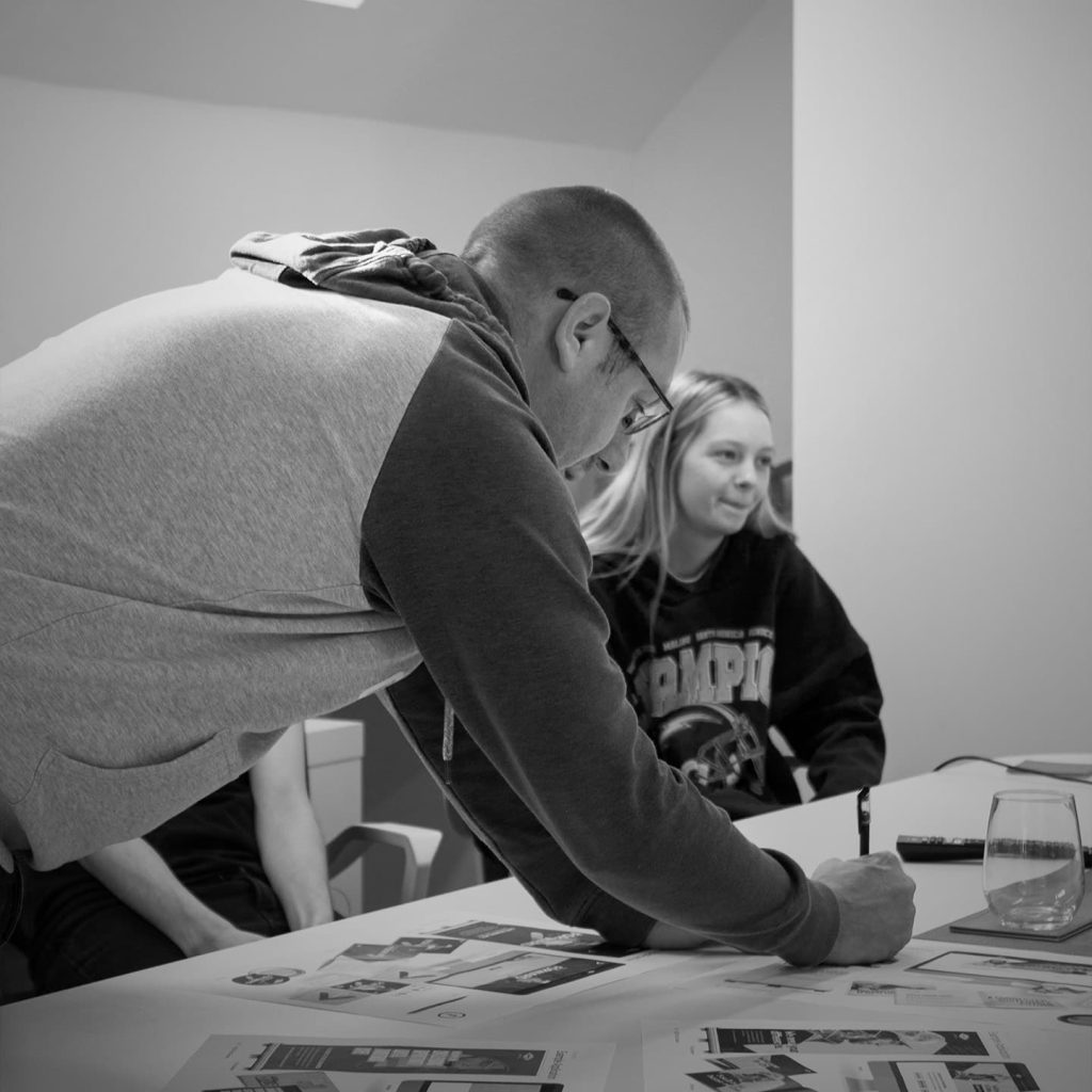
Armed with valuable insights, Herd Group design team translated the recommendations into actionable solutions. We created mock-ups for the home, clinic, and local landing pages, tailored to both desktop and mobile devices. These prototypes incorporated the following enhancements:
- Streamlining of conversion points, ensuring a unified outcome for all web conversions, namely, scheduling consultations
- Humanising the user experience to foster relatability, a consultative approach, and a warm, customer-centric atmosphere, moving away from a purely conversion-driven focus.
- Simplification in design, exuding confidence, and emphasising the clinic’s expertise and readiness to support users.
- Integration of high-quality, authentic photography featuring real staff, consultants, client concerns, solutions, and clinic interiors, delivering a more genuine user experience.
- Implementation of a streamlined colour hierarchy to reduce visual complexity and improve user comprehension.
Outcome:
Herd Group delivered a comprehensive UX and CRO audit, along with actionable recommendations and prototypes, designed to significantly enhance lead generation for our client. By aligning the user experience with a more user-centric, consultative approach and addressing key pain points, we provided the clinic with a clear roadmap for improving their website’s effectiveness in converting visitors into valued clients. This holistic approach not only enhanced the website’s aesthetics but also contributed to strengthening the clinic’s position as an industry leader.


